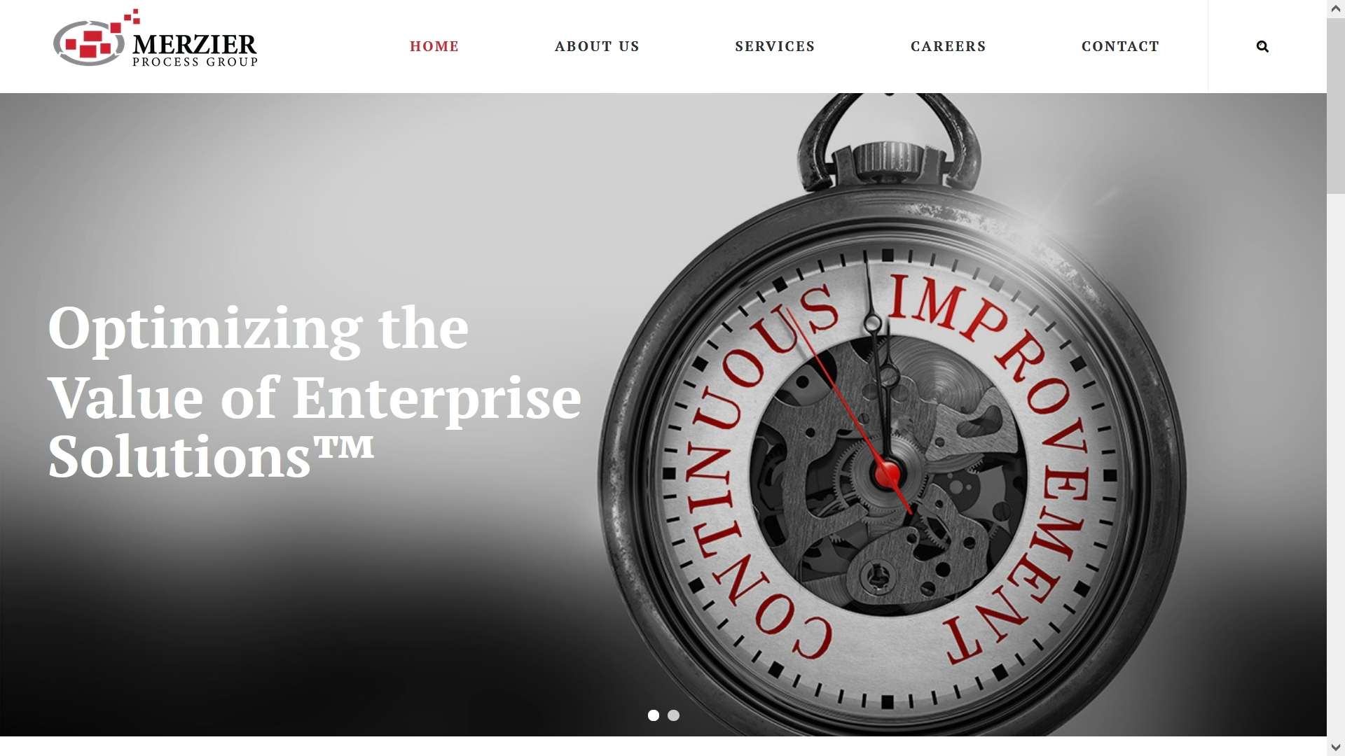
Before Copia Corporate Rebranding

The MPG website and branding did not provide an enjoyable aesthetic or efficient user experience. The logo and branding colors were nondescript. Textually, the site was bloated; the potential client’s problem, benefits of your services, and solution(s) offered were unclear; the slider was outdated and inconsistent; and most importantly, there was no clear call to action.

Drag the orange line for before and after

After Copia Corporate Rebranding

The CCG site and overall rebranding provides an aesthetically-pleasing, simple, clean, and modern interface for your potential client. The logo was designed to appeal to government and large commercial clients specifically and evokes a sense of stability, reliability, and experience. The branding colors evoke cost-effectiveness and creativity.

The website provides an enjoyable and efficient user experience, communicates clearly that you understand your potential client’s problem(s), presents the benefits of working with you, and gives a clear indication of the solutions you offer. The site gets directly to the essentials of the information that your potential client needs to know and provides a clear call to action on every page so they know what next steps to take.